Dimensions Dashboard Analysis
The Dimensions dashboard offers a comprehensive overview of a tenant's expenses, categorized according to customizable criteria (dimensions) tailored to the organization's needs.
Key Features
- Dimension Tabs:
The dashboard provides tabs that allow users to switch between different dimensions. These dimensions can be customized to align with the tenant's unique classification systems, such as projects, departments, or any other relevant categorization.
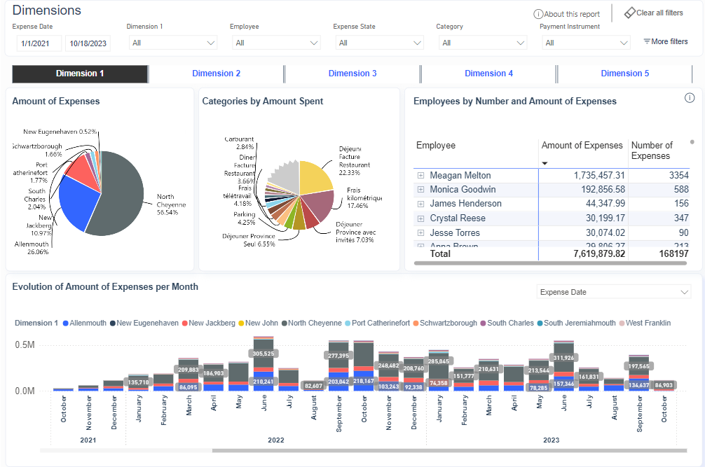
- Top Expense Categories:
A visual representation of the top expense categories based on the selected dimension, providing insights into the areas where the tenant is allocating the most resources.
- Expenses Evolution broken down by dimension:
A graphical representation of the evolution of expenses across different categories over time, allowing users to identify trends and potential areas for optimization or cost-cutting measures.
- Expense Dimensions Breakdown:
A pie chart or other visual representation that illustrates the distribution of expenses across various categories, providing a quick overview of the tenant's spending patterns.
- Employee Expense Table:
A detailed table listing all employees and their corresponding expense amounts.
By accommodating tenant-specific classification systems, the Dimensions dashboard empowers organizations to extract valuable insights that might otherwise remain buried in their data. This capability is particularly beneficial for firms dealing with specific expenses across multiple projects, as it allows for precise tracking of cost distribution on a project-by-project basis, enabling improved project management and resource utilization.
The dashboard's flexibility and customization options make it a powerful tool for strategic decision-making, enabling businesses to gain a comprehensive understanding of their spending patterns and identify opportunities for optimization and cost-saving measures.